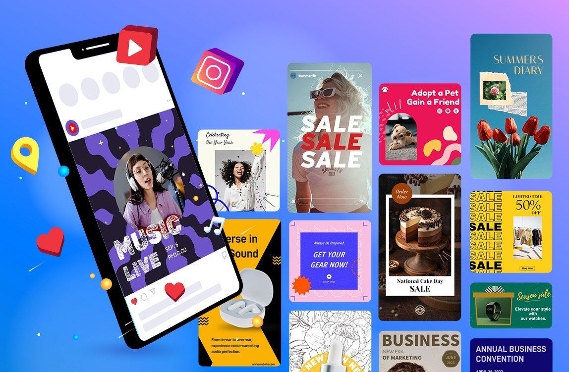
The very second that someone scrolls by your poster on Instagram or clicks by your banner on a story ad, you’ve already lost. Posters don’t live on walls like they once did. Posters live within feeds, between Reels, alongside trending content, and beneath thumbs that take milliseconds to determine what they want to give attention to. That’s why swipe-stopping design has become the language of visual marketing. The best designs take the rhythm, contrast, and pacing found in social media and apply it to design.
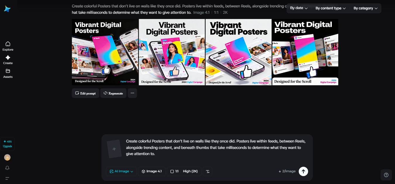
This is exactly where Dreamina simply steps in. Rather than making assumptions about content, artists-turn-content-curators now test, create, and perfect concepts using AI-powered visual thinking tools.
An AI image generator tool, such as Dreamina, allows artists a quick rubric through which they can test styles, lighting, composition, and mood, prior to running a single ad campaign, thus making advertisements stand out from the visual buzz of social networks rather than be sucked under.
Posters that behave like feeds, not frames
Old-school posters were built for distance. They used large fonts, centered logos, and clean symmetry so that a person walking past could quickly read them. Social feeds flipped that logic. Now, posters have to feel native inside scrolling environments where everything is cropped, layered, and in motion even when nothing actually moves.
Modern formats draw in their DNA from the feed itself.
-
Tight crops, like someone just snapped a photo.
-
Text that overlaps imagery instead of sitting politely beside it
-
Color blocks that feel like story stickers or caption bars
-
The visual hierarchy communicates in the same zigzag manner as how people scan a phone screen.
Instead of reading top to bottom, people read posters the way they read a feed. First the image hits. Then the headline. Then the tiny details if the first two earned it. Designers now build layouts to win those first two seconds of attention.
How scroll culture reshaped visual hierarchy
Social media didn’t only change where posters appear. It changed how people visually think. We are trained by feeds to look for faces, contrast, emotion, and something that feels unfinished, like there is more to discover.
That’s why the modern design of posters relies on:
-
Asymmetry that feels more ‘snapshot-like’ than ‘layout-like’.
-
Bold focal points rather than balanced compositions
-
Space feels cropped instead of neatly framed
It’s not about perfection; it’s about interruption. A poster that looks too perfect gets ignored, while the one that feels like a plucked moment of a story stops the scroll.
When static posters borrow from video culture
Even in a still poster, so much of the visual language often comes from video. Everything from motion blur to depth of field, from lighting gradients down to dramatic angles-everything emanates from the way we watch reels and ads every day.
Designers create short concept clips or scene previews from text prompts or reference images in order to test lighting, mood, and framing. Those frames then inspire the still layouts. The video is not for looping or animation. It’s more like a cinematic sketchpad that lets creatives explore storytelling visually before locking in a final frame. You can use a smart AI tool like Dreamina’s AI video generator to animate your image. You only need to upload your image and the description prompt for it.
This approach makes posters feel like frozen moments from something bigger, which is, of course, what stops people mid-scroll.
The rise of cinematic micro-stories in ads
Every successful social ad tells a small story. Posters do the same thing today. They don’t say it all but suggest it.
Which a good modern poster might say:
-
Someone just came into the scene
-
Something is going to take place
-
A revelation is at hand
That feeling of anticipation parallels the ways people interact with reels and stories. We’re wired to stop when something feels mid-moment. Designers create that feeling with light and shadow, cropping, and typography that feels like a subtitle rather than a headline.
The artistic side of swipe stop visuals
Not all posters are designed to directly sell. Some are more about building mood, identity, or cultural presence. And it’s in this place that Dreamina’s AI art generator has proven very useful in branding workflows. Designers create abstract textures, painterly backgrounds, or stylized characters to give campaigns a unique visual voice. These art-driven assets make posters feel less like ads and more like content that people would willingly stop for.
Something that’s artistic stands out against feeds full of product shots and predictable layouts. That contrast is what earns attention.

It is the Dreamina moment when ideas turn visual
Eventually, every scroll-inspired concept has to materialize into something tangible. This is where Dreamina comes in: not as a shortcut, but rather a space for visual thinking.
Step 1: Define a text prompt
Navigate to Dreamina and begin by creating a fully realized prompt that articulates not only the visuals you are interested in seeing but the feel you are attempting to convey within the social posting. Lighting, angle of the subject, emotion you wish to convey through it, and the manner in which the subject is then presented within the mobile phone screen are all considerations.
A good example of a prompt might be: A vertical poster with a high level of drama for a streetwear brand launch featuring a partially dark figure with neon streetlights in the background and headline letters floating above the figure’s face with high contrast lighting and a deep, social media ad feel.
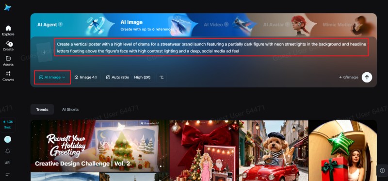
Step 2: Set parameters and generate
After preparation of the task, you can select the model you have in mind for your visualization, adjust the aspect ratio according to where you intend to post the poster, adjust the resolution to perhaps 1k or perhaps 2k, depending on the clarity you wish to attain, and click on the Dreamina icon to create. These considerations are important because the nature of a poster demands vertical framing and sharp text edges.
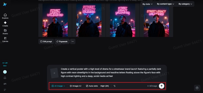
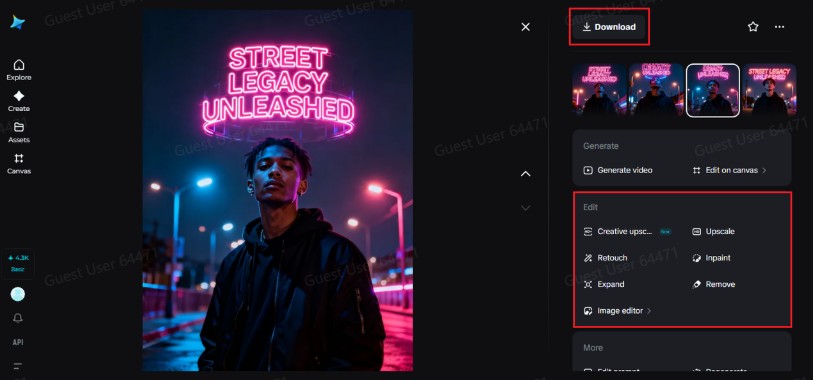
Step 3: Edit and Download
Once the visual has been created by Dreamina, the next step is refining it with inpaint technology in order to correct minute details, extend the visual to provide more breathing space for texts or facial details, eliminate elements which are deemed to be distractions in the visual, and touch up the lighting or texture. Such minor tweaks will enhance the conceptual design from good to swipe-stopping. Once the design is optimized, the Download icon is clicked.
What modern brands do before posting
Among the greatest changes in the marketing world has been the speed with which ideas are now tested. Brands do not take weeks to determine whether an idea will work. They test variations and also tone based on consumer response.
Dreamina is a part of this cycle by allowing visual experimentation to happen fast. A brand could come up with three different versions of a poster that convey a different mood or perspective, and then choose which one is the most scroll-worthy. This is the data-driven creativity that prevents a campaign from going stale.
Conclusion
Swipe stopping design no longer has to do with bolder and bolder colors or larger and larger fonts. Swipe stopping has to do with understanding how users actually interact in digital space and how design succeeds when it has a native feel to its rhythm. Social posters are noticed. Ads from the last century get ignored.
What makes it easier to conceptualize these ideas is the fact that Dreamina facilitates this process. With the help of Dreamina, it makes it possible for the creators to conceptualize concepts, test the mood, and even work on details even before something hits the public domain, thus symbolizing the dynamic world of poster design even in modern times when nothing but attention stands between a product and obscurity.