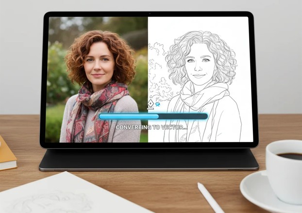
A photograph contains more information than a line drawing can carry. Skin texture, reflected light, fabric folds, shadows, background objects, and tiny changes in color may all help a photo feel realistic, but most of them become clutter when translated into black lines. The real work is not tracing everything. It is deciding what deserves to survive the conversion.
That distinction matters whether you are preparing a tattoo reference, making a portrait sketch, planning a craft pattern, or creating an illustration that must reproduce clearly. A useful line drawing has a hierarchy. The outer contour establishes the subject, a smaller set of interior lines explains its structure, and selective accents provide character. When all visible edges receive equal weight, the result usually looks noisy and uncertain.
Modern conversion tools make the first draft much faster. A free tattoo stencil maker can isolate tattoo linework from a photo, while an image to line drawing tool can interpret portraits, pets, objects, or landscapes in several drawing styles. Neither route removes the need for judgment. The strongest results still begin with a suitable source and end with a careful review.
Start by Defining What the Lines Need to Do
Before choosing a tool or style, identify the job of the output. A tattoo stencil is not the same thing as a pencil portrait, even when both start from the same photograph.
A stencil needs transferable boundaries. Lines should be clear enough to guide placement and durable enough to remain legible when printed at the intended size. Soft lighting information often has to be removed or translated into a limited set of deliberate shapes. A decorative line portrait can tolerate broken contours, fine hatching, and expressive variation because it is viewed as a finished image rather than used as a working guide.
Craft patterns have another requirement. A shape may need to be cut, engraved, embroidered, or colored. That means enclosed areas, minimum line spacing, and the physical limits of the material matter more than photographic fidelity. A detailed pet portrait that looks beautiful on screen may become impossible to cut as a vinyl decal.
Write down three conditions before converting:
- The final physical or digital size.
- Whether the line art is a finished piece or an intermediate guide.
- Which features make the subject recognizable.
Those answers determine how much detail to keep.
Choose a Source Image That Can Survive Simplification
The best source is not always the most attractive photo. It is the one with the clearest visual separation.
Look for a subject with a readable silhouette, reasonably even lighting, and limited overlap between important features. A side-lit face may be dramatic, but if one eye disappears into shadow, a converter must guess where the feature begins. A pet photographed against a similarly colored blanket may have a weak outer contour. A tattoo on a sharply bent arm introduces perspective distortion that must be corrected before its proportions can be trusted.
Cropping is often the highest-value edit. Remove unrelated background objects and leave a modest margin around the subject. This gives the conversion process fewer false edges to interpret. If the photo is dark, adjust exposure gently rather than pushing contrast to the maximum. Excessive contrast can merge separate dark areas into one block and erase subtle boundaries.
For an existing tattoo photographed on skin, try to reduce glare and curvature. Photograph the area straight on, use diffuse light, and avoid stretching the skin into an unnatural position. If only an older or imperfect photo exists, the output should be treated as a reconstruction reference, not an exact record of the original linework.
Build a Visual Hierarchy Instead of Tracing Every Edge
An edge in a photograph is simply a change in brightness or color. It is not automatically a useful drawing line. A shadow under a cheek, for example, may look like a hard boundary to an edge detector even though no literal line belongs there.
Good line art usually has three levels:
- Primary contours define the silhouette and major overlapping forms.
- Secondary lines explain essential features such as eyes, petals, joints, folds, or ornament.
- Texture marks suggest fur, grain, scales, or shading without filling every surface.
When reviewing an automatic result, hide the original image for a moment. Can you still identify the subject? Then reduce the preview to the approximate final size. Do the important features remain distinct?
If the answer to the first question is no, the drawing may have lost defining structure. If the answer to the second is no, it probably contains too much fine detail.
This small-size test is especially useful for tattoo concepts and printed crafts. Lines that look comfortably separated on a large monitor can close up when printed, transferred, or viewed from normal distance.
Clean Up the First Draft
Automatic output should be considered a draft. Most corrections fall into four categories.
First, remove background remnants. A stray chair leg or horizon line can intersect the subject and look intentional after conversion. Second, reconnect important broken contours. Gaps can be expressive in illustration, but they are less useful where a stencil or cutting path needs continuity. Third, delete false detail created by glare, compression artifacts, skin texture, or patterned fabric. Fourth, correct ambiguous intersections. Viewers should be able to tell which form sits in front.
Line weight also deserves attention. A uniform line can feel mechanical, but too much variation makes reproduction unpredictable. For many practical outputs, slightly stronger outer contours and lighter internal details create a clear hierarchy. Avoid making every small texture mark as dark as the silhouette.
If you plan to edit the result, retain a high-resolution master. Perform cleanup before reducing it to the final output size. A raster image can be edited in a photo editor, while vector tracing may be helpful for cutting machines or projects that need extensive scaling.
Vectorization is not automatically an improvement, however. It can turn soft curves into too many control points, so inspect the paths rather than assuming the conversion is clean.
Review a Tattoo Stencil as a Working Document
A tattoo stencil has a specific role. It communicates placement and structural linework, but it does not contain every decision an artist will make with the needle. Shading, color transitions, texture, and adaptation to anatomy may be handled separately.
Check the stencil at actual print size. Confirm that parallel lines remain separated and that small negative spaces have not closed. Look for areas where several contours converge. Those junctions can become visually heavy on skin.
Confirm orientation as well, especially if the design includes lettering, dates, coordinates, or asymmetrical symbols. Printing and transfer methods can introduce mirroring, so the final direction should be checked deliberately.
For a stencil reconstructed from a tattoo photo, compare proportions against several stable landmarks rather than trusting one curved section of skin. The photograph may compress one side of the design. A digital flattening process can help, but a professional artist should still assess scale, body placement, and changes required for the individual client.
Prepare Line Art for Printing or Reuse
Use a clean white background unless production requires transparency. Export at sufficient resolution and avoid repeatedly saving a working file as a low-quality JPEG. PNG is often safer for crisp black-and-white artwork.
Run a test print before using specialty transfer paper, sticker stock, or craft material. It will reveal whether thin strokes disappear or dense areas merge. Keep the source photo, unedited conversion, and cleaned master as separate files so later revisions do not start from a compressed output.
More lines do not necessarily mean greater accuracy, and stronger contrast is not a universal fix. Evaluate every result according to its final purpose. Also use images you own or have permission to transform. Automation changes the format, not the rights attached to the source.
A Better Workflow Is Selective, Not Automatic
Photo-to-line conversion is most valuable when it removes repetitive tracing and gives you a strong starting point. The final quality comes from choosing the right image, defining the output’s job, controlling visual hierarchy, and testing at real size.
The goal is not to preserve every visible edge. It is to preserve the information a viewer or maker actually needs. Once that becomes the standard, it is much easier to decide which lines belong, which details can disappear, and where human review still matters.